


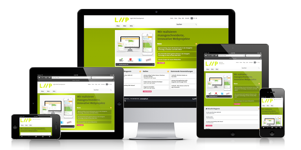
Recent studies have shown that almost a quarter of all mobile users use their cell phones exclusively to access the World Wide Web. One in four people throughout the world who own a Smartphone uses it to browse the internet. Your business website needs to function well on these devices unless you risk in losing a lot of mobile users. Hence, it is now time for you to embrace the use of a responsive design. In this article, you shall learn of some tips which can help you start off in increasing the responsiveness of your website.
- Get Mobile First
Before you start planning your designs for either desktops or the laptop screen, you must think about what the user experience will be on mobile devices. Many designers are embracing the mobile-first designs. Why? It is because mobile phones are becoming more practical than desktops. Today more people use cell phones to browse the internet than ever before. So you ought to build a site that is mobile friendly first, and then create the designs for sizes of larger screens.
- Get familiar with Media Query
The media query is a feature that allows contents to respond under different conditions over a specific device. Media queries will check the device’s resolution, its height, its width and its orientation. Then it will use the information in determining which design rules should be applied. Media queries help in creating a responsive design.
- Understand what will Mobile Mean for the Users
People will interact with different websites in different ways over Smartphones than what they will do on a desktop. Analytics must be used for figuring out why users are visiting your page from their phones. Perhaps they want to access quick information via search bars. If you find this to be common amongst your users, then please see to it that your search bar is easily visible and easily accessible.
- Use of Percentages
The hardest part of responsive design is in implementing a grid that is fluid. Fluid grids work well along with the media queries in displaying contents on various viewports. You can set a specific layout size instead of having to design different breakpoints for different viewports. After that, you will set heights and widths according to proportions and not pixels. It will help your site to adjust layouts according to percentages.
- The Requirement for Speed
Responsive designs can take time to load pages. Smartphone users would want their websites to load faster. Sites take more time for loading when the images used are not optimized, too many elements can weigh the website down. It will lower the responsiveness of your website. So you have to scale your bigger images down.
- Eliminate unnecessary stuff
You should remove excessive and unnecessary elements from your site; it will aid in user experience and also make your website generate a higher speed for loading. Websites that have too much of superficialities are not attractive. All the elements which are not vital to your site have to be immediately removed. It will lighten your website and provide only the most necessary information.
- Ensure the Readability
See to it that your users are not required to squint for them to be able to be reading or to pinch the screen to be able to zoom. The text sizes have to be such that they can be read over the small screen, like a font size of 12 pt. Keep the text size optimum.
- Use the Right size of the Buttons
For mobile devices, space is premium. Avoid too small sizes for your buttons. See to it that the buttons are a minimum of 44 x 44 pixels to ensure easy tapping. Use padding instead of putting margins. Padding will increase your tappable area which margins will not. Margins will simply increase that white space beside the buttons.
- Designed to aid Screen Orientation
Statistics reveal that the landscape orientation is more popular than the portrait orientation by 59% over 41%. You must create your website so that it looks good over both orientations, but you have to pay increased attention to the landscape mode. You have to ensure that your images do not become stretched. You can get in touch with Singapore SEO consultant to solve all your web designing queries.
Conclusion
Responsive designs will make it much easier for all your users to see your website from any device which they may use. These tips will help you to make a responsive design. Increasing the mobile responsiveness of your site will help to get you more viewers who will consequently help you to get more customers for your business over the internet.
Author bio:William Smith is a noted web design expert and blogger. Here has mentioned about practical tips to make your website design responsive. He has also thrown light on the web designing services of a Singapore SEO consultant.


